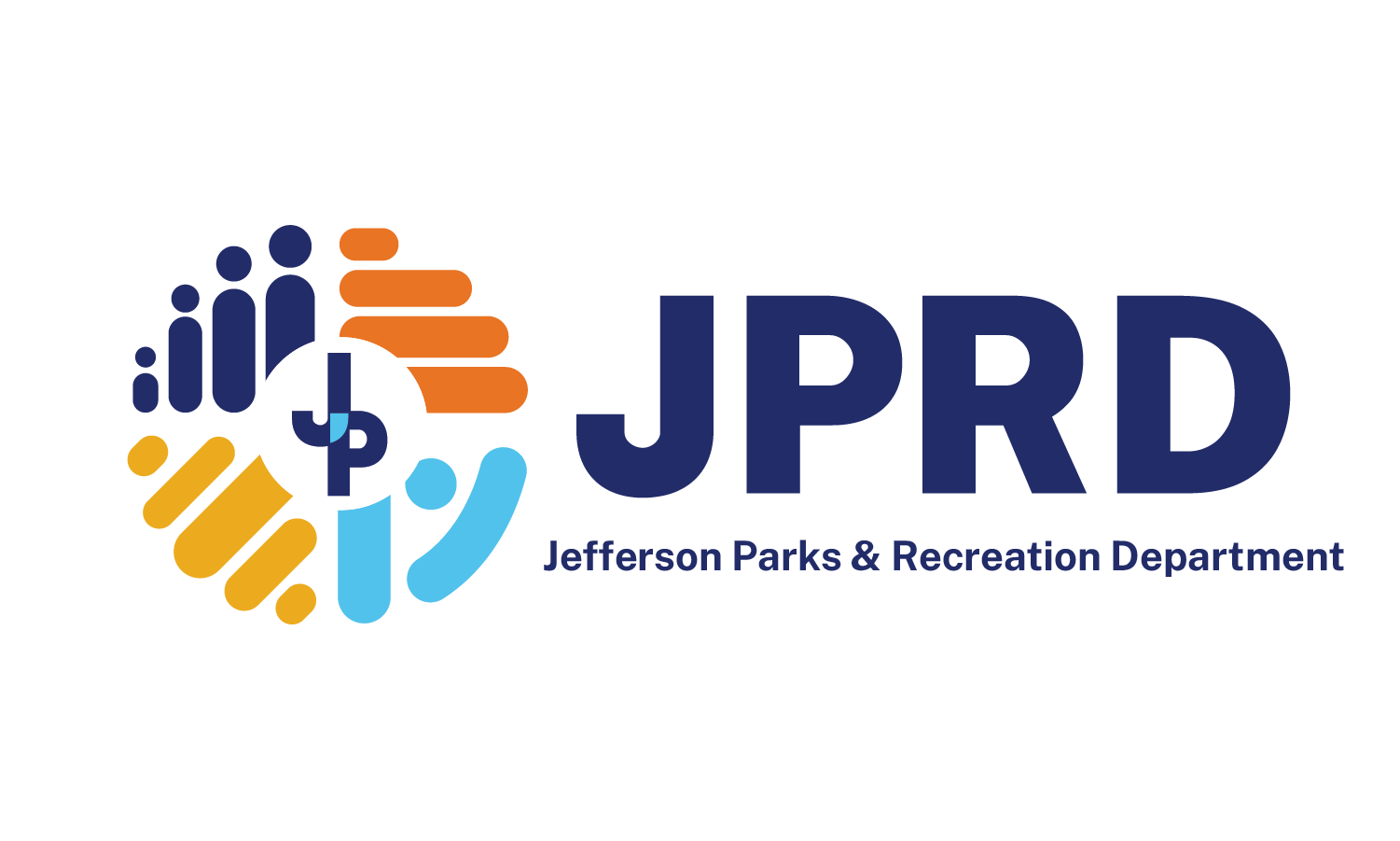
The employee Logo Committee developed the Jefferson Parks and Recreation Department’s new logo to represent the JP community and the services offered across the Parish. In late 2021, JPRD created an employee logo committee to redesign our logo for a stand-alone look that was cohesive to the Parish brand and represented the department’s values as a whole.
The JPRD Director and Information Specialist created the employee group with sixteen employees who ranged in division and position in the department. The Information Specialist led the team through numerous workshops to achieve the logo that the JPRD Administration presented on May 23, 2022. Over the series of seminars and meetings, the logo committee voiced opinions and provided critical feedback to the logo and design consultants.
The logo features four quadrants representing the community, solid foundation/growth, action and enjoyment, and opportunity.
Top left: Community
These figures shown from smallest to largest represent the diversity and different ages of people in the community.
Top right: Solid Foundation and Growth
These horizontal steps with the heaviest at the bottom signify a strong foundation. We are climbing, growing, and reaching new heights. Orange represents optimism, creativity, and adventure, among other positive associations.
Bottom left: Action and Enjoyment
These yellow lines upward and to the right illustrate movement inspired by athletics, music, entertainment, and recreation. Yellow represents the sun and outside, where much of our department’s sports classes and activities occur.
Bottom right: Opportunity
The V-shaped character represents the outstretched arms of the victorious. Similarly, it symbolizes giving with open arms and reaching for an opportunity. Blue is also associated with the outdoors and nature and has significance in traits such as loyalty, honesty, and commitment- elements of successful teamwork.
